

Colour Is Not Decoration. It Is the First Decision.
Why the most coherent wardrobes begin with a palette, not a purchase.

There is a version of the colour conversation in fashion that begins and ends with trend forecasting, the Pantone Colour of the Year announcement, the palette report from WGSN, the season’s ‘key colour’ as identified by the consensus of runway coverage and retail buying. This conversation is not wrong. It is simply incomplete, and its incompleteness has produced a widespread misunderstanding of what colour actually does in dress.
Colour is not a finishing decision. It is not applied after the silhouette, construction, and proportion have been resolved. In every wardrobe that communicates something coherent about its owner, not necessarily expensive, not necessarily extensive, but legible as a perspective, colour is the first decision made and the last one that can be changed. It is the element that travels furthest, lands first, and is processed before any other visual information about what a person is wearing.
The research on colour perception in social contexts is extensive, even if fashion often simplifies it into seasonal language. Across colour psychology, apparel studies, and consumer perception, colour repeatedly appears as one of the earliest and most influential visual signals in impression formation. This is not only a finding about fashion. It is a finding about human perception. The visual system registers colour almost immediately, before most people have consciously evaluated cut, fabric, construction, or label.
What this means practically is that the colour of what you are wearing is communicating before you have made any other communicative decision. Before posture, before expression, before the first word. The communication may be accurate or inaccurate. It may be intentional or default. But it is unavoidable.
The designers who understand this at a structural level rather than at the level of seasonal trend response, treat colour as architecture. Bottega Veneta under Daniel Lee made green function almost like a brand signature, while Phoebe Philo’s return has been built with a restrained, recognisable colour discipline. These are not isolated colour choices. They are specific relationships between values that create a visual language identifiable before the label is read. The garment does not need to be seen in full to be recognised. The colour has already begun to tell you what world it belongs to.

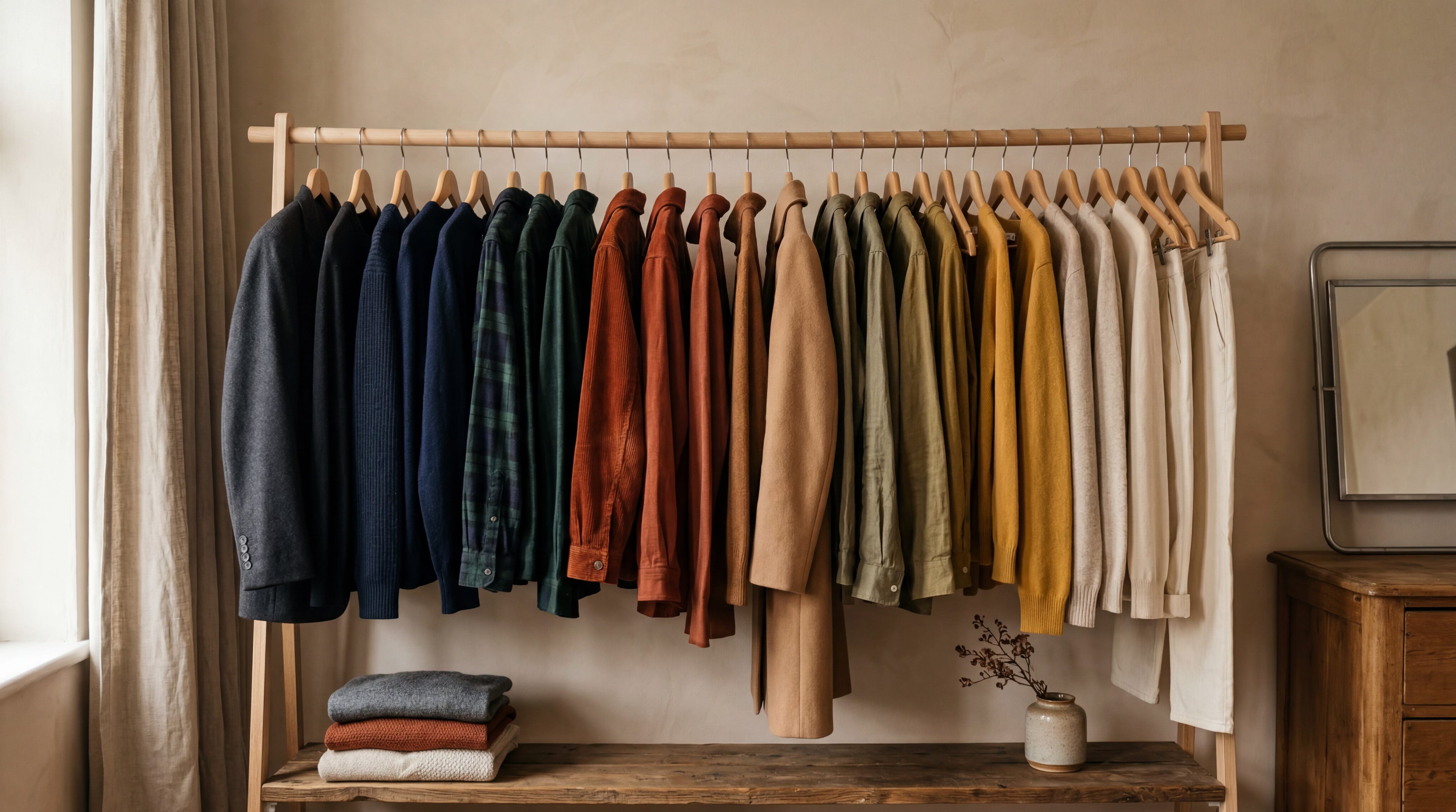
The personal wardrobe equivalent of this architecture is what stylists and image consultants describe as a colour anchor, a dominant value or small palette of related values that appears consistently enough across a wardrobe to produce a recognisable visual identity. This is distinct from uniform dressing, which eliminates variation. A colour anchor allows variation within a coherent system. The result is that the decisions about what to wear become structural rather than daily made once, and then working within a framework, rather than remade each morning against an undifferentiated set of options.
The most consistently well-dressed people in any professional context are not necessarily the ones spending the most or owning the most. They are the ones who made the colour decision once deliberately, with some understanding of how their specific colouring interacts with specific values, and then stopped making it every day.
The mistake most people make is that they treat colour emotionally in the shop and strategically only after the purchase has failed. They buy the colour that looks beautiful on the rail, the colour that belongs to a woman they imagine becoming, the colour that photographs well on someone else, the colour that feels like a holiday, a promotion, a new personality, a different life. Then it enters the wardrobe and becomes difficult. It does not sit with anything. It makes the face look tired. It asks for shoes that do not exist. It turns one outfit into a project.
This is why so many wardrobes are full and still feel underdeveloped. The problem is rarely absence. It is contradiction. Too many colours are trying to express too many versions of the same person, and the result is not variety. It is noise.
Black is often where that noise goes to hide. Not because black is wrong — black can be precise, elegant, severe, protective, sensual, and intelligent, but because black is frequently used as a postponement of taste. It becomes the answer before the question has been asked. What colours sharpen you? What colours soften you? What colours make your skin look expensive rather than exhausted? What colours make you feel more present in your own body? What colours do you return to not because they are safe, but because they are accurate?
The best colour decisions do not make a wardrobe smaller. They make it more legible. They reduce the number of failed experiments, the number of almost-right purchases, the number of pieces that require too much persuasion to be worn. They create repetition without boredom, recognition without costume, confidence without performance.
A personal palette is not a limitation. It is an editing principle. And in style, as in language, the edit is often where the intelligence appears.
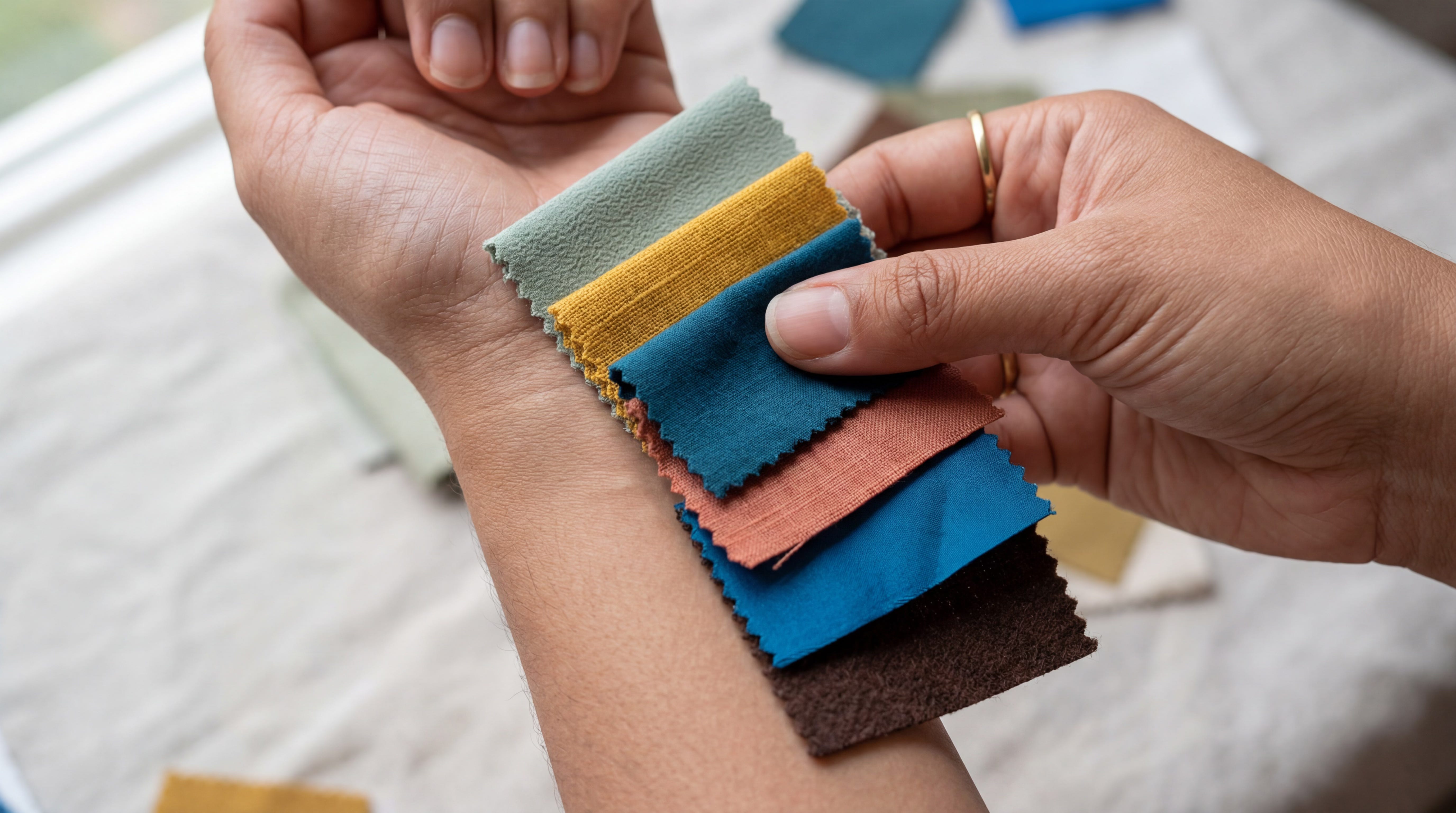
The secondary colour decision, accent or contrast follows from the anchor. Its function is not decoration but punctuation: a specific value used deliberately at a frequency that keeps the palette alive without destabilising it. Camel as anchor, burgundy as accent. Stone as anchor, specific cobalt as accent. The relationship between the two values is what produces sophistication. Any single value in isolation is simply a colour. Two values in a considered relationship are the beginning of a visual language.
The fashion system produces new colours every season because seasonal change is its economic model. That model has no particular relationship with what individual people’s wardrobes need. The most useful thing any of this month’s trend coverage could produce is an examination of what colour decisions produce longevity rather than novelty, because longevity is what converts a collection of clothes into a wardrobe.
Colour is a strategy. It works whether you treat it as one or not. The question is whether the strategy is being made by you, or made by default.
The default is always less interesting than the decision.